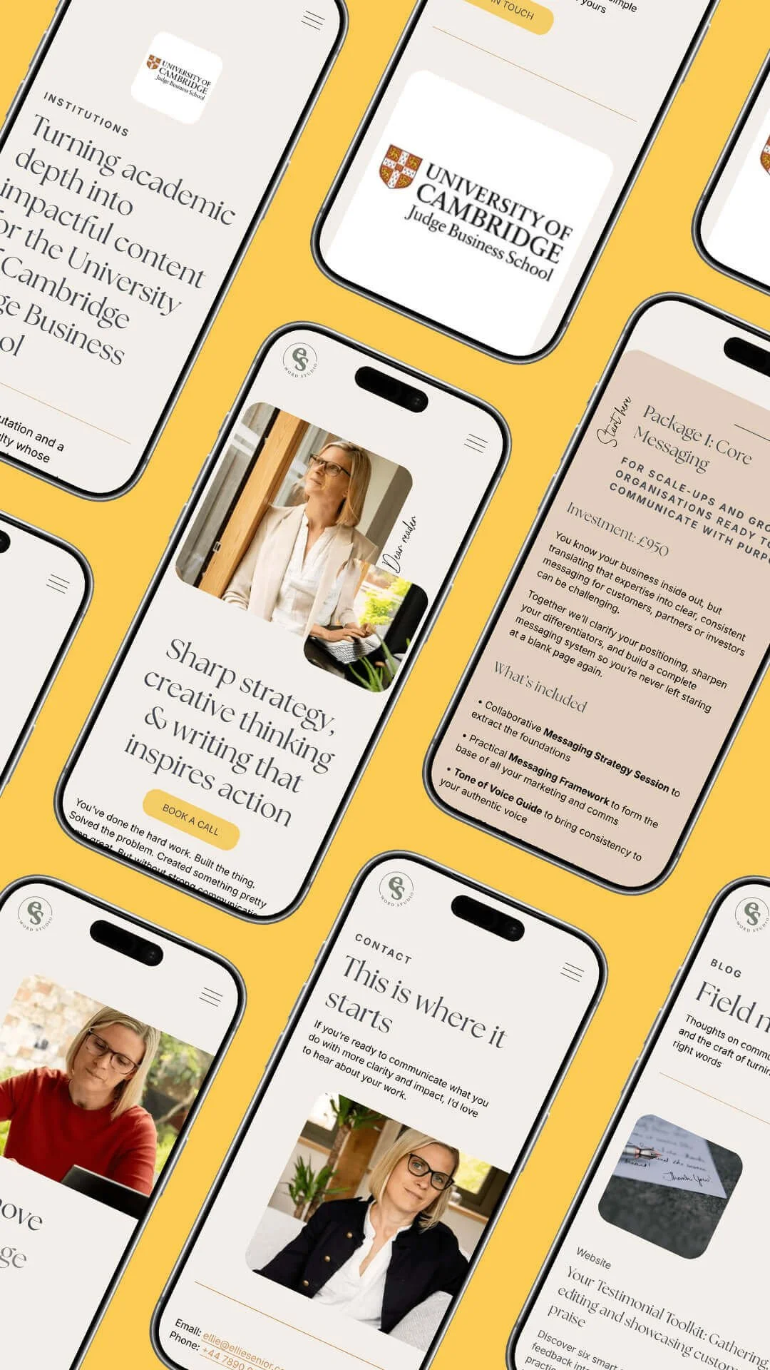
VISUAL BRAND IDENTITY + BESPOKE SQUARESPACE WEBSITE FOR STRATEGIC COPYWRITER
Ellie Senior Word Studio
Founded by former teacher turned strategic copywriter Ellie Senior, Ellie Senior Word Studio helps independent businesses and growing organisations turn complex ideas into clear, resonant messaging - work that spans core messaging, website copywriting, content strategy and comms consultancy.
Ellie works with clients across outdoor adventure, architecture and the built environment, and STEM - sectors that need expert-level clarity without the jargon. Her point of view is simple: language is a superpower, and the right words move mountains.
Services
Brand and website strategy
Visual brand identity design
Logo suite + iconography
Creative direction + consultancy
User Experience (UX) design
Collaborative project management
Squarespace website design + development
SEO Consultancy
SEO technical optimisation
Launch copy support

The challenge
Outgrowing a DIY brand
Ellie had built a strong reputation and a loyal client base under Ellie Senior Copywriting, but the visual identity was a DIY job from her early days in business. It didn't reflect the quality, professionalism or strategic depth of the work she was producing for clients.
Evolving the business
As Ellie prepared to evolve the business - sharpening her positioning as a strategic copywriter rather than a general freelancer, and introducing a new business name to match - she needed a brand that felt considered rather than cobbled together. Something that struck the same balance she brings to her writing: polished, but with a human, artisan touch.
The brief
The brief called for refined simplicity that was grounded but not corporate. And a website that gave visitors clear pathways to get in touch, book a discovery call or sign up to her newsletter - without ever feeling like a hard sell.
WHAT KSD DID
Finding the brand archetype
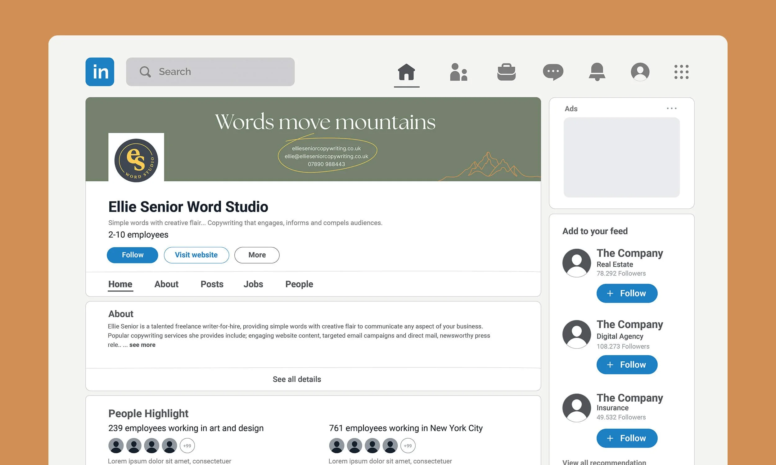
Ellie's own words did a lot of the early work. Her "words move mountains" narrative - built around clarity, craft and the belief that simple language travels furthest - pointed clearly towards the Sage archetype: a brand personality rooted in truth-seeking, wisdom and expertise, expressed with warmth rather than self-importance.
KSD used this as the foundation for a mini visual brand identity, distilling Ellie's values of clarity, craft, warmth and intentionality into a system that could flex across her four core services - Core Messaging, Website Copywriting, The Content Engine and Comms Consultancy.
Building the visual identity
An earthy, grounded palette
The palette moved away from generic "outdoorsy" cliches - no heavy wood textures or whimsical adventure fonts - towards a natural, earthy set of tones: Sage Green, Slate Navy, Warm Cream, Mustard Yellow, Terracotta and Warm Stone. Grounded and versatile, it suits Ellie's outdoor adventure and architecture sectors without ever tipping into pastiche.
Typography with a human touch
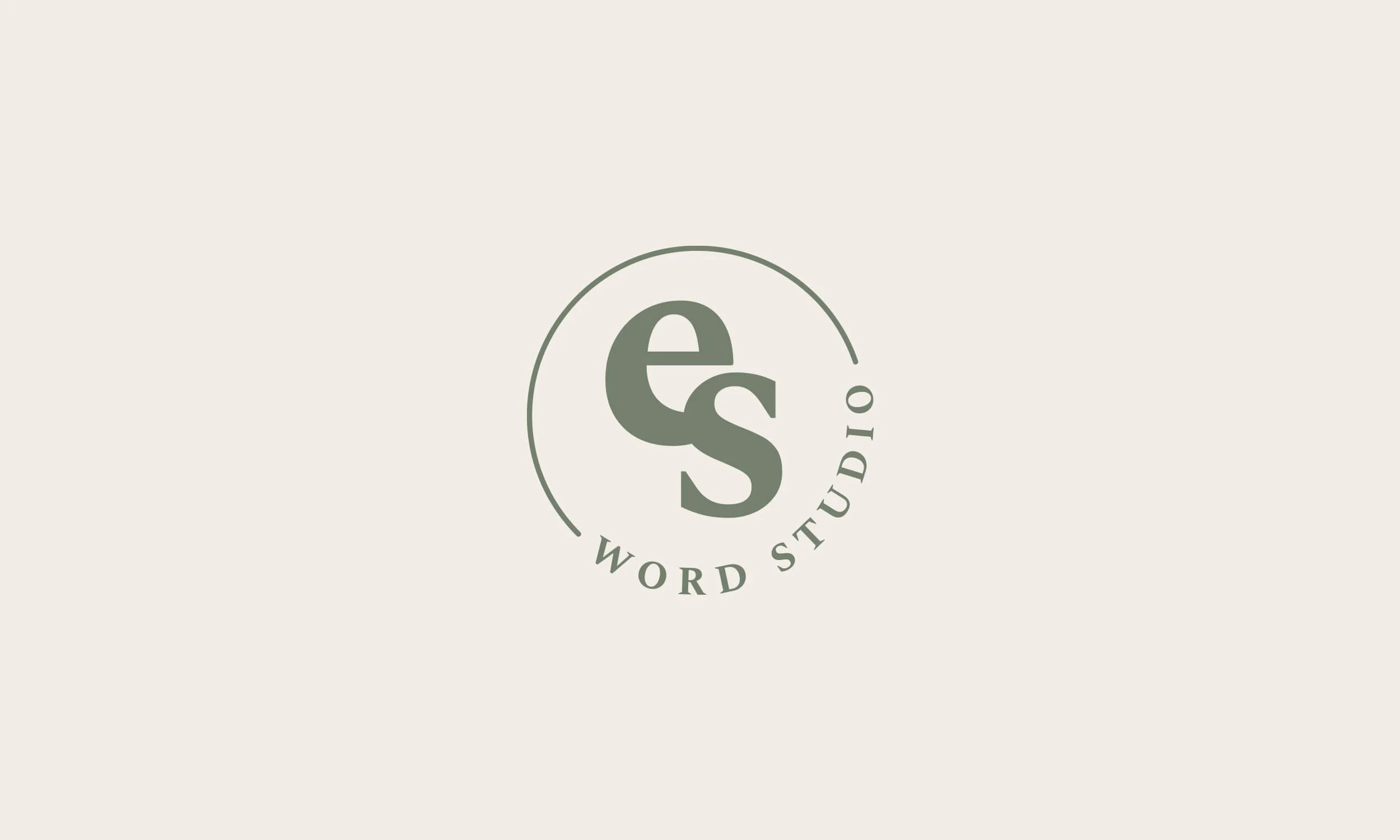
The typography pairing gave the brand that same balance Ellie asked for: a refined, editorial wordmark for the logo, a heading style with quiet elegance and craft, and a clean, confident sans serif for body copy that keeps everything easy to read. A decorative script accent was introduced sparingly to bring in the handmade, artisan warmth Ellie wanted to carry over from her original branding - used no more than once per section, so it always feels intentional rather than decorative filler.
Bespoke service icons
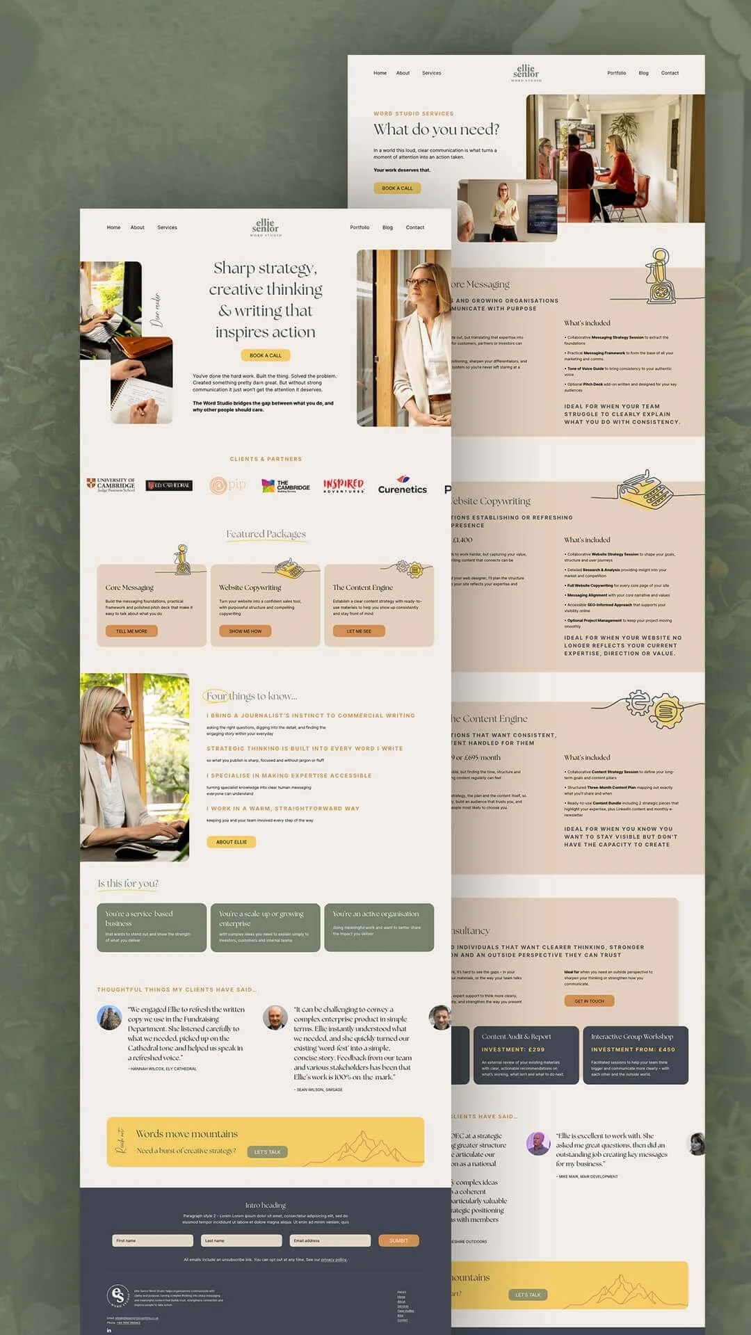
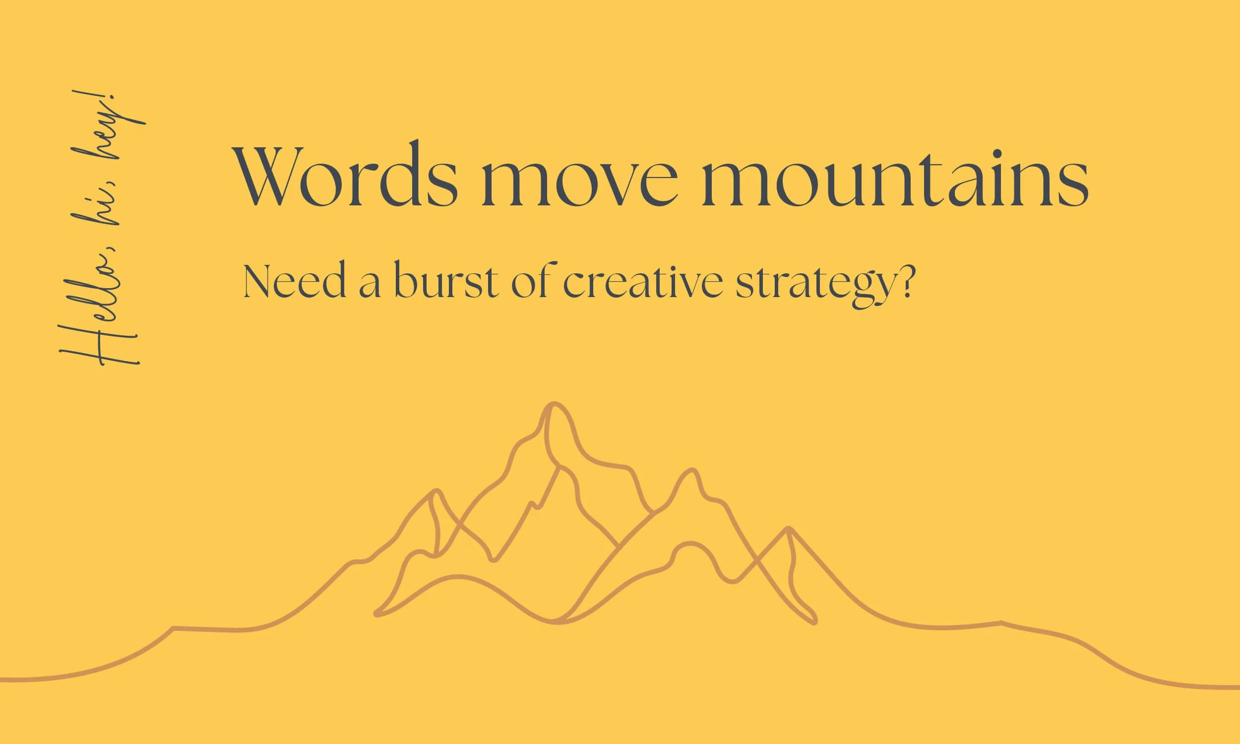
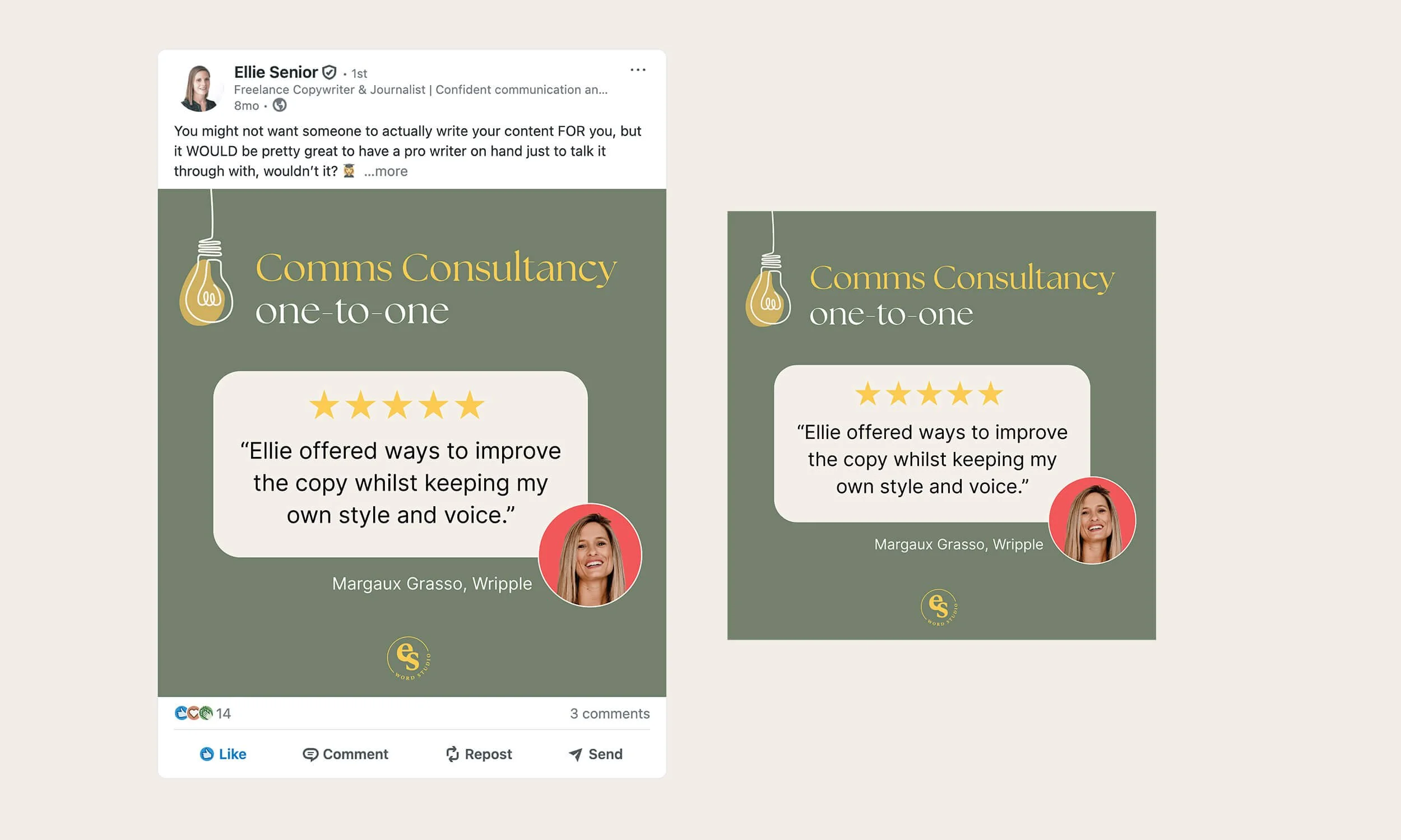
Four bespoke service icons were developed in a continuous line drawing style - a candlestick telephone, a vintage typewriter, interlocking cogs and a lightbulb - tying craft and clarity together visually across the brand, ready for an outside illustrator to bring to final execution.

Designing a website with clear pathways
From Wix to Squarespace
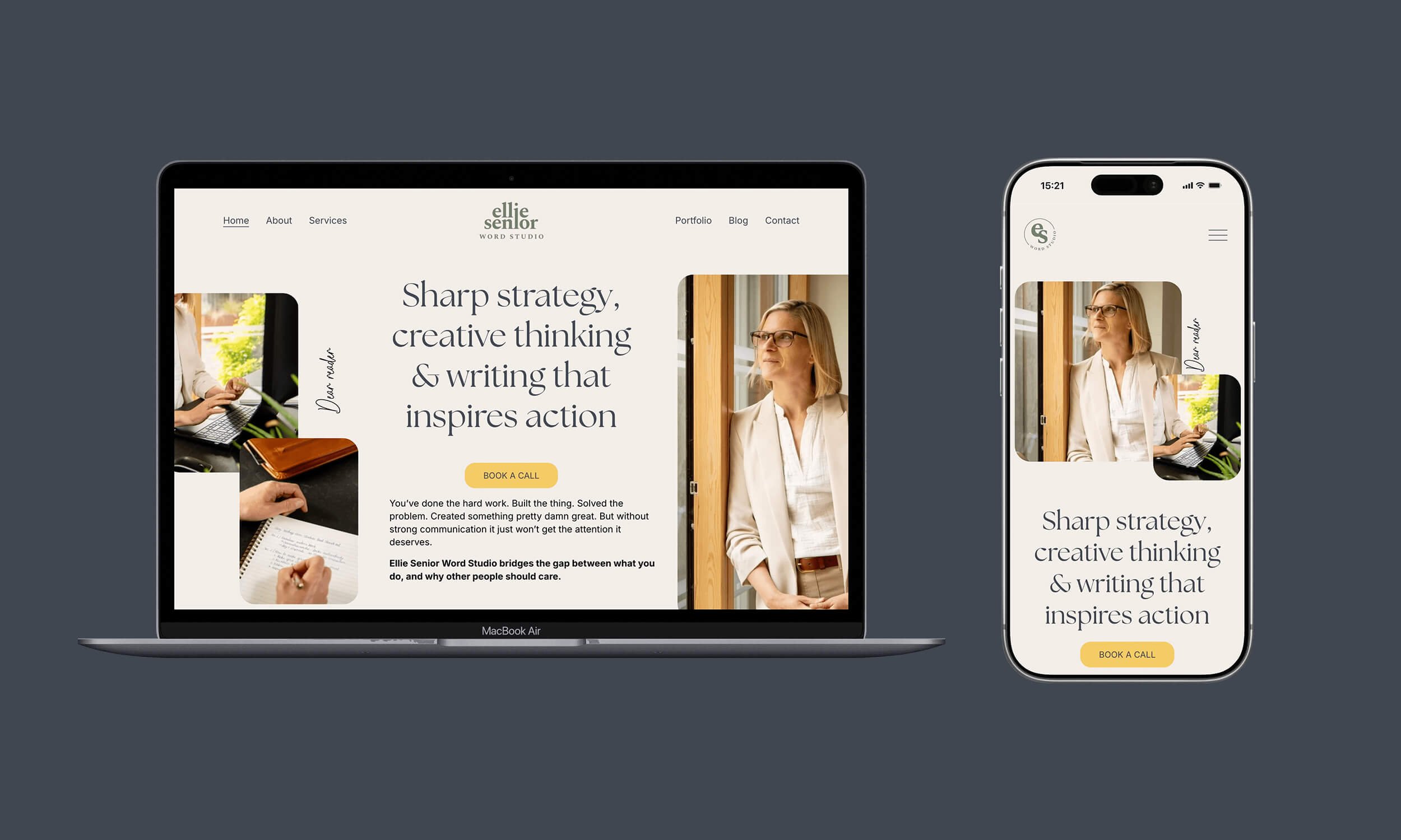
Ellie's site was originally built on Wix, which meant every update relied on a level of technical fiddliness that didn't suit a busy solo business owner. Moving the build to Squarespace was a deliberate decision to give Ellie a platform she could manage herself confidently, with the flexibility to grow the site as her services evolve.
A homepage with purpose
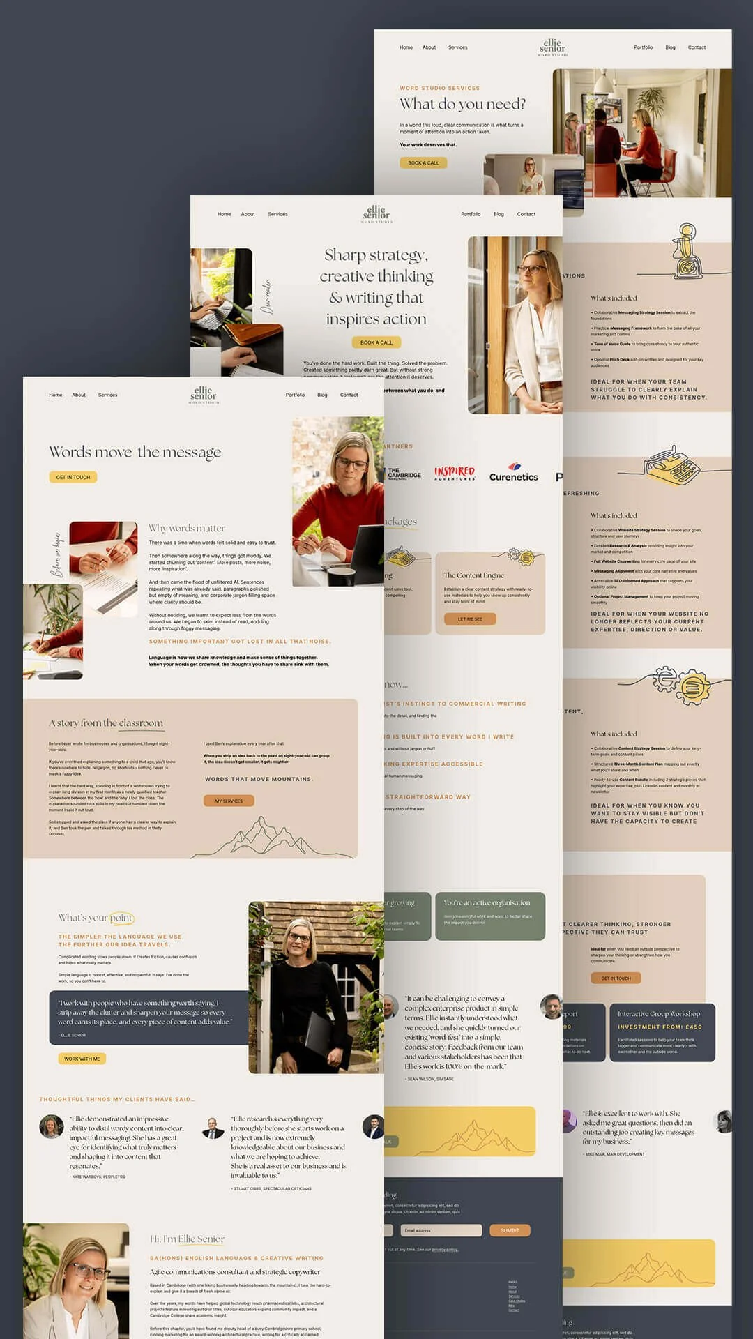
That same intentionality shaped the design itself. Rather than defaulting to a template-led layout, KSD built a homepage structured to do three things well: guide visitors towards getting in touch, booking a discovery call or signing up to the newsletter, in that order of priority. The result is a site that reads as clean, clear and authentically human - a deliberate counterpoint to the "AI mush" and content noise Ellie's own brand narrative pushes back against. A "Nice things my clients have said" style testimonial section, inspired by the short, sharp client quotes Ellie had admired on other copywriting sites, reinforces that same directness throughout.
Testimonials and a smooth domain move
KSD distilled Ellie's client testimonials into punchy, high-impact snippets for use across the site, and the new domain, elliesenior.co.uk, was set up with a redirect in place from her original domain to protect the SEO equity she'd already built.
THE RESULT
Ellie Senior Word Studio launched with a visual identity and website that finally match the calibre of Ellie's writing - grounded, refined and unmistakably crafted. The brand gives her a system she can use consistently everywhere from her website to social media, without needing to make it up as she goes.
The new site is live at elliesenior.co.uk, built to support Ellie's ambition to become the go-to strategic communications partner in her sectors - work that lets her keep doing what she does best: turning chaos into clarity, one client at a time.